

How to build a Checkbox with React.

I am a developer from Kenya. CS student and passionate programmer. I program in Python and Javascript mostly. Knowledge of what I don't know moves me so I always try to better myself.
Hello 👋🏼
I will walk you through building a simple checkbox input.
Initial Setup
First, initialize a React project ⚛️ with CRA(create-react-app) and remove all the boilerplate code in the source project.
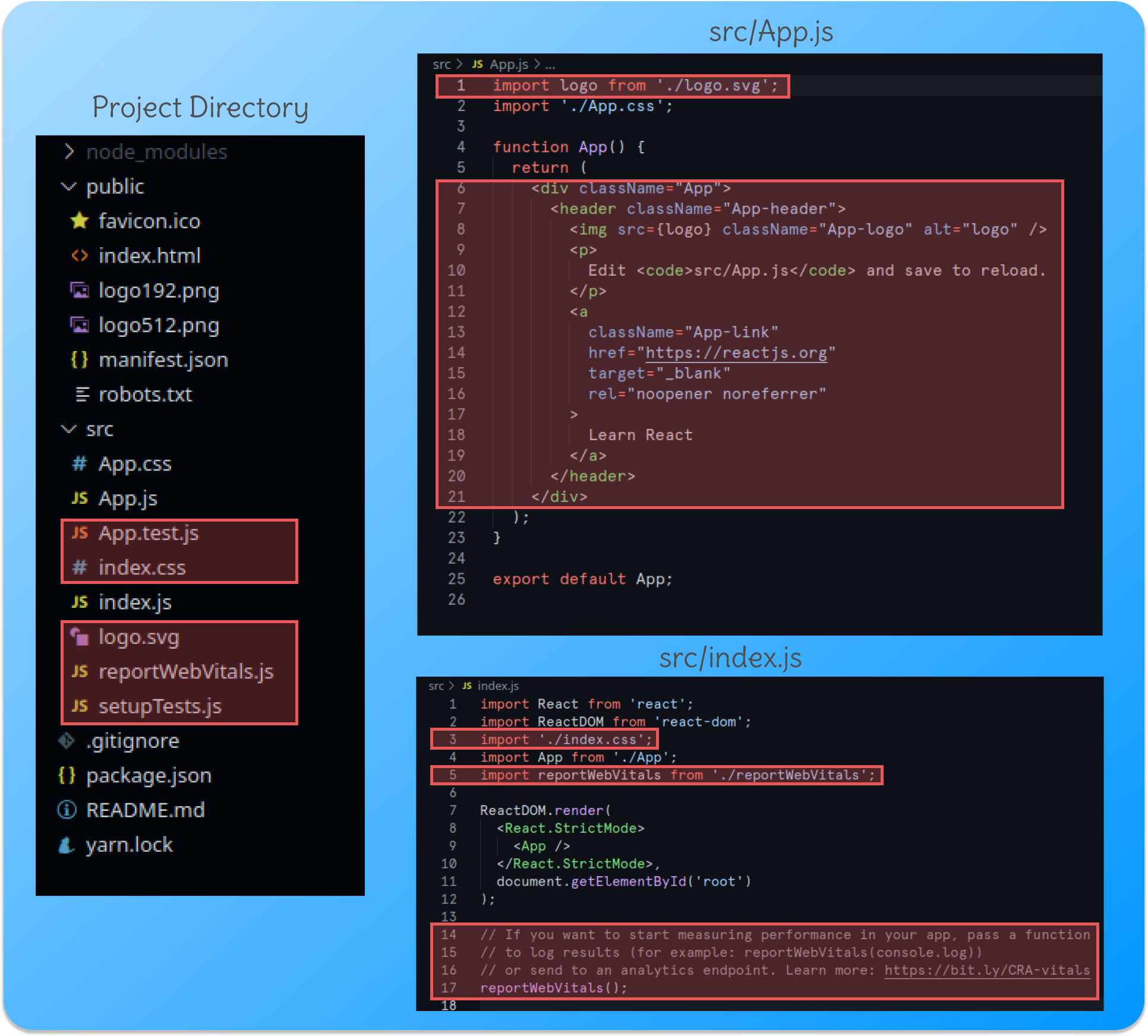
Now we can create a basic checkbox component.
- Create a file and name it Checkbox.js inside the
srcfolder - Add the following code for a basic functional component.
export default function Checkbox() {
  return <h1>Check Box</h1>;
}
- Import the Checkbox component to App.js
import "App.css";
import Checkbox from "./Checkbox";

export default function App() {
  return <Checkbox />;
}
- Run the dev server. You should get something similar to this;
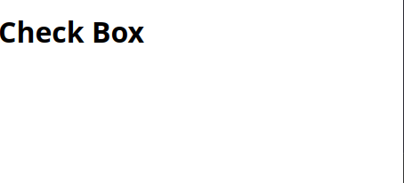
Creating the Checkbox Component.
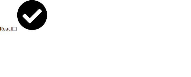
We can now add functionality like checking and unchecking the checkbox and form handling.
Checking and Unchecking
Import the check-icon. You can download the icon here, add it to the project folder then import it.
Define a
checkedstate and anonCheckfunction to toggle the checked state when theonChangeevent is fired on the checkbox.
import check-icon from "./check-icon.svg";

function Checkbox() {
  const [checked, setChecked] = React.useState(false);
  const onCheck = () => {
    setChecked(!checked);
  };
  return (
    <label htmlFor="checkbox">
      React
      <input
        id="checkbox"
        type="checkbox"
        value="React"
        checked={checked}
        onChange={() => onCheck()}
      />
      <img src={check-icon} alt="check" />
    </label>
  );
}
We add an extra callback to the onChange event listener because setting the
checkedvalue on the input fires the onChange event resulting in multiple rerenders.
The output should now look like this:
Passing props to the Checkbox
You will need to identify the checkbox uniquely and give it a value dynamically. Let's add props to do just that. This way the label always points to the correct checkbox and the checkbox id remains unique in case you are rendering using multiple checkbox components.
- We define a prop
nameto allow the parent to pass the name to the prop.
import check-icon from "./check-icon.svg";

function Checkbox({name}) {
  const [checked, setChecked] = React.useState(false);
  const onCheck = () => {
    setChecked(!checked);
  };
  return (
    <label
      htmlFor={`checkbox-${name}`}
    >
      {name}
      <input
        id={`checkbox-${name}`}
        type="checkbox"
        value={name}
        checked={checked}
        onChange={() => onCheck()}
      />
      <img src={check-icon} alt="check" />
    </label>
  );
}
- Now you can pass whatever name you want to the Checkbox component.
import Checkbox from "./Checkbox";

function App() {
  return (
      <Checkbox name="React" />
  );
}
Styling the component
At last, let's style the component to make it visually appealing. Add these styles inside the App.css
.react-check-box {
  width: 100%;
  background-color: #534b52;
  display: flex;
  justify-content: space-between;
  border: 2px solid #474448;
  border-radius: 5px;
  font-size: 1.5rem;
  padding: 1rem 2rem;
  cursor: pointer;
  color: #e0ddcf;
  transition: background 400ms;
  box-shadow: rgba(0, 0, 0, 0.35) 0px 5px 15px;
  margin: 5px 5px;
}

.react-check-box input {
  display: none;
}

.react-check-box img {
  width: 1.5rem;
  opacity: 0;
  fill: #e0ddcf;
  transition: opacity 400ms;
}

.react-check-box-checked {
  background-color: #2d232e;
}
.react-check-box-checked img {
  opacity: 1;
}
Now add dynamic styles to the Checkbox component to look different if checked or unchecked.
import check-icon from "./check-icon.svg";

function Checkbox({name}) {
  const [checked, setChecked] = React.useState(false);
  const onCheck = () => {
    setChecked(!checked);
  };
  return (
    <label
      htmlFor={`checkbox-${name}`}
      className={`react-check-box ${checked ? "react-check-box-checked" : ""}`}
    >
      {name}
      <input
        id={`checkbox-${name}`}
        type="checkbox"
        value={name}
        checked={checked}
        onChange={() => onCheck()}
      />
      <img src={check-icon} alt="check" />
    </label>
  );
}
That's all there is. This is the working project on CodePen. Hope you enjoyed the article.
Remarks
Congrats 👏🏼 for reading my post till the end. I hope I taught you to build something cool today.
If I missed something, don't hesitate to mention it. If I made a mistake, please correct me.
We can stay connected on Twitter or find out what I build on Github.
Have a productive day. Thank you 🙏🏽 .


